
2021 NO.30
Menu

The Colors of Japan Resonating with the Soul

The Legacies in the Colors of Japan
Written by: Kitamura Hitomi (Curator, National Crafts Museum)


The names of the traditional colors of Japan often contain references to a craft item or point to a deep relationship to its production. These ingenious names reveal the discerning and careful awareness Japanese people have had towards the colors around them.
In modern society, as we become increasingly buffeted by inorganic, identical objects, such as televisions, computers, and mobile phones, the delicate textures and profound tones of traditional crafts, which have been cultivated through history, have gained a stronger presence in our lives in recent years.
Let’s take a closer look at this thoughtful and refined Japanese sensibility to colors through crafts—treasures preserved across generations.

Black and Red: Classic Colors of Japanese Lacquerware
When picturing the unique colors of Japanese lacquerware, black and red likely come to our mind (photo 1).
Red was the first of the lacquers to arrive in Japan—this was about 9,000 years ago, around the early Jomon period (circa 7,000 to 12,000 years ago).
Red was considered sacred as the color of fire, blood, and the sun. In the Jomon period, combs and vessels were given multiple coats of red urushi (Japanese lacquer, which is a natural resin coating processed from sap) for superstitious reasons. In the later Yayoi period (100–300 AD), black urushi became mainstream, supposedly because the superstitions of the Jomon period had faded by then and more importance was placed on the shape and function of vessels.
There are two groups of red urushi; they differ in the origin of the pigment component. One is cinnabar, which uses red pigment with mercury sulfide as its main component, and the other is Bengala, which is a brownish-red pigment made by firing red clay that contains Ferric oxide. Bengala pigment is used not only for Japanese lacquerware, but also for painting ceramics and buildings.
Black urushi is made by adding iron powder and soot that is fine carbon powder generated by the incomplete combustion of pine resin, oils and fats, and the like.
Mumyoi ware, which is made in Sado Island, Niigata Prefecture, is pottery made from the local red clay containing iron. Ito Sekisui V, a current master potter, uses vivid red clay and yellowish clay collected in Sado to create fine color gradations on beautiful works that resemble textiles (photo 2). The powerful vitality that people likely sensed in red in ancient times seems to be pulsing deep within this magnificent pattern.
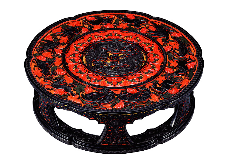
Tsuishu Yozei XX <Low table, six-petaled flower design> 1915, National Crafts Museum
In this work, the unique black and red of urushi are superbly appropriated. While preserving the technique of carving out patterns from urushi that has been painted in layers, Tsuishu added modern shaping instincts for his work.
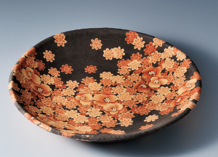
Ito Sekisui V, <Mumyoi Neriage Plate with Flower Patterns> 2015, private collection.
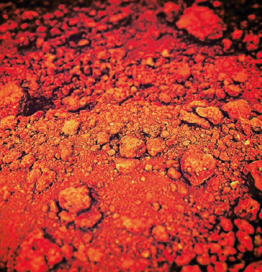
Sado red clay collected in the vicinity of Aikawa Gold & Silver Mine.

Blue: As Seen in Pottery, Dyeing, and Weaving
The color of glaze on pottery changes greatly before and after firing. Glaze is made by dissolving clay with water and then blending with wood ash, straw ash, or metallic elements as coloring. For this reason, the liquid is gray and cloudy before firing, but after being applied to the vessel and fired in the kiln, it remarkably transforms to hues such as clear blue, jade green, or even pale pink. Potters repeatedly fire numerous test pieces in the kiln, striving to control the slightest change of tone to the utmost limit.
One type of ceramic that intrigues many potters is celadon. Iron (ferric oxide) in glaze has a chemical reaction to fire and takes on a color ranging from a bright light blue to a greenish blue. Celadon that is a crystal-clear blue similar to clear skies after the rain especially is a highly-sought and illusive treasure among collectors. Because perfectly fired celadon was offered only to those with high status, the color of celadon was also referred to as hisoku (hidden color), with the connotation being that it was beyond the reach of the general population and not allowed to be easily seen.
With reverence for the connotations of the word hisoku, dyeing and weaving artist Shimura Fukumi sees this color in the context of textile, related with the tones of indigo that materialize in the indigo dyeing process. Toward the end of aidate (the process of fermenting indigo dye in preparation for dyeing threads and the like), indigo weakens and loses its blue color, while faintly coloring other threads in a color that is a cross between ultramarine and pastel blue (a midtone between a deep purplish blue and a soft whitish blue). Aidate is analogous to a person’s life of being born, growing up, and aging, and only when we safely arrive at the final chapter can we witness the “profound, enigmatic color” (Shimura Fukumi, 1982, One Color, One Life, Kyuryudo) that she cherishes.
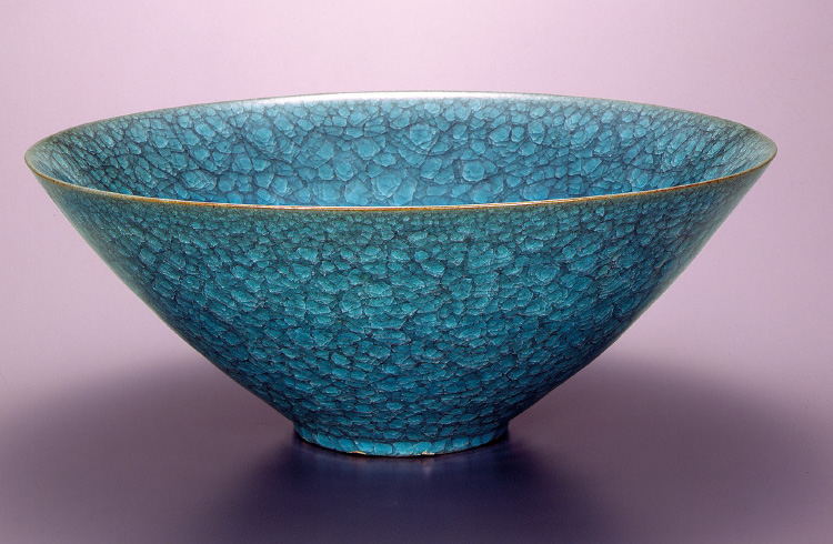
Shimizu Uichi <Large bowl, celadon> 1973, National Crafts Museum
Countless cracks from what is called “crazing” develop in the glaze, creating an indescribable effect.
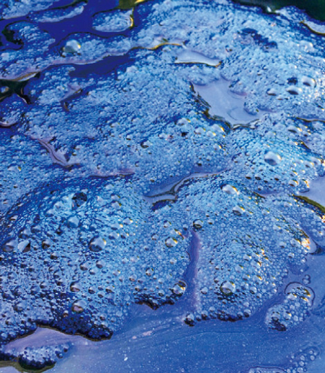
Dye solution for indigo dyeing.
Photo: amanaimages
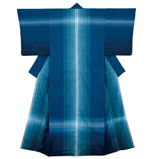
Shimura Fukumi <Kimono, “Lapis Lazuli Blue”, tsumugi silk> 1976, National Crafts Museum
Comprises light and dark blues achieved with aidate.